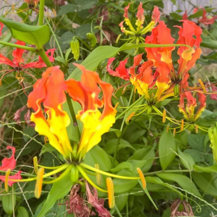
In response to the posts I published last week about my explorations in watercolour painting, which you can find here and here, a friend sent me the following photo and asked, ‘Is this too hard to paint?’
My response was ‘I’ll give it a go’. Below you can see my various attempts, and after each image I’ll say what I think of it. Feel free to do the same in the comments section, below.
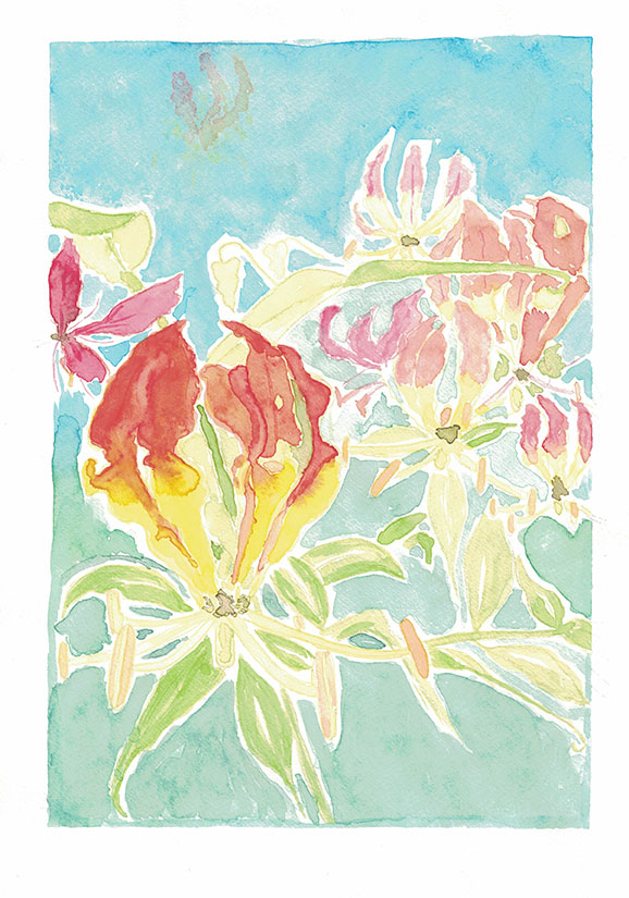
That’s definitely not as vibrant as the original that I have here. My first thought was to try and draw the outline of the main flower (in the lower left) free hand, but then I decided to upload the image to Photoshop and put a grid over it, and draw it by the grid method.
Then I thought, ‘It’d be annoying to do a poor drawing. Why don’t I trace over the outlines and then transfer the tracing onto the paper I want to paint on?’ I quickly realised I’d end up with a reversed image if I did that, which would probably have been manageable, but I didn’t want the added complexity of looking at the reference image and having to reverse it in my mind. So I ended up using a 6B (i.e. very soft) graphite pencil and scribbling all over the back of my tracing, then laying this pseudo-carbon sheet down on my paper, and once again going over the traced lines. Success! I finally had an image to start with.
Given that yellow was going to be fairly prominent in this piece, I wanted to reduce the weight of the graphite lines so the yellow wouldn’t look murky, so I used a kneaded eraser (thankfully I’d see on YouTube just a day earlier how to use one) to lighten all the lines, and then I went over them with watercolour pencils. All this took a couple of hours – much longer than it needed to, but I’m learning, so it’s o.k.
A rookie mistake I made with this piece was trying to replicate the composition of the photo. The flowers in the background took ages, and I’m not even that pleased with them. I think they also detract from the main flower. I also set out to fill the top part of the background with flowers and leaves – you can see the ghost of a flower up there in the ‘sky’. Ah well.
What I am pleased with in this one is the overall effect of all the colours. I like how the blue of the sky fades down into the blue-green background of the lower part. I think it’s quite a pretty piece.
However, my ‘client’ (and I should stress, there’s no money changing hands here!) wasn’t so keen on this composition. So I decided to see how I’d do at just knocking out a quick freehand version, with no sketch and no fussy background. That’s this next piece, which took me about 20 minutes.
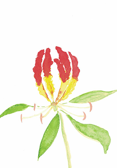
For some reason, I completely forgot about the ‘double-loading’ technique, which I’d learned the week before from a book (see my post More Rookie Art). This would have been the ideal time to use it.
Although this piece came together quickly, I don’t really like it. But my client does! She likes the sharp lines I’ve used in this one. I felt it needed a background, but given that my friend had already said she liked it, I didn’t want to tamper with it.
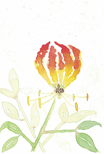
So I did a third version…
That looks really washed out, so here’s one in which I’ve reduced the brightness so you can see that there are splatters of pale green paint and a few more leaves than are visible in the above. These images were scanned, not photographed. Seems like the scanner must wash the colour out. Must do some reading about that. I thought scanning might be the best way to get a nice, clean, well-lit shot. Anyway, here’s the Photoshopped one…

Hmm…Well, the original is much nicer, but you get the idea. I used the double-loading technique on the petals and managed to get some nice blending between the red and the yellow. Then I put the stem and the darkest leaves on, but it looked incomplete. So I went in with a more dilute version of the same green and did the paler leaves. Finally, I used almost clean water – just the merest hint of green pigment in there, and did a third layer of leaves. Then I thought the top of the composition looked a bit bare, so I loaded up a stiff brush with the leftover palest-green wash and splattered it around a bit.
I’m actually really pleased with this one. Of the three attempts, it’s my favourite. My client wasn’t so sure, so I’ve sent her attempts 2 and 3 and she can choose which one she likes best. I think when she sees 3, it’ll be that one. I’ll be interested to hear.
Same time next year
While I was busy with this piece, I was also exploring art videos and related websites, and sharing some of them with my niece. She suggested that I choose a design and paint it now, and then paint the same design again in a year’s time, to see how much I’ve progressed. ‘What a great idea’, I thought, ‘And I know just the design’.
So I’ll have another go at the flame lily this time next year.
Just before I go, here’s a link to an amazing artist called Tiffanie Turner. This is botanical art gone 3D. Amazing stuff.
Thanks for reading.

I really love the first attempt. The subtle gradient background helps the bright colours of the flower to stand out and for a first attempt at this type of flower I think you’ve done a wonderful job.
Creating the second and third piece has allowed you to study the flower further and end up with slightly different, but equally eye-catching, final designs.
I would love to see how you come back to this in a years time as I know you will have developed what is ‘your own style’ and many new skills!
Reading your blog has been so inspiring because in such a short time you have picked up a new hobby and begun to really master the techniques. Some people take years to develop and achieve what you have in just mere months. I’m excited for your artistic future!!
LikeLike
Thanks Darshana! I really appreciate your encouragement.
LikeLike